Table Of Content
As each list item contains no more than two lines, the supporting visual is center-aligned vertically with the text and the toggle, which is separated from the text with a subdivider. We chose this UI design because it’s a great example of how you can make image lists work on a mobile UI. This list UI design proves, that whatever a website’s content, there’s always a visually appealing solution out of which a user friendly interface can be created. In this case, we’re faced with a list of cryptocurrencies followed by information such “market cap” and “current price”. A popular technique for rendering lists more scannable are the expanding and collapsing list actions. These allow users to expand certain items to reveal more detail and subsequently collapse the item again to get an overview of the list.
List UI Design: Tips For Creating Enjoyable Interfaces
To create the best UX, not all list designs are presented directly. Some designers often use drop-down menus or navigation bars to show or hide their lists. In this way, users can easily choose to expand or collapse the list options according to their needs. To create a scannable and eye-catching list design, you should keep all list items connected, logical, actionable, and consistent. Some list UI designs, especially the intuitive image or card lists mentioned above, can not only deliver the page content better, but also help you increase the visual appeal of your project easily. They can also leave a huge impact on the usability of your project in a good way.
Ordered List Arrow Cards
They also used white space wisely to guide the eye to important elements, such as the current task, then the time each task is to be completed at. This holiday itinerary app is a great example of how to use a two-line list with full-bleed separator lines to create a list UI design that’s easy to scan. We really like the simple pastel design of this UI, in addition to the single-line list. The designer made great use of the limited mobile UI space available and included some nice visuals, along with all the information needed at a glance, such as ticket prices and amounts saved up. Travel Xplore was a design project to create a list UI design that displays a number of travel destinations on offer.
Simple list styling
Spacing - White spaces between different elements inside an item or between different items affect the user experience. Too crowded lists or items are hard to read and discourage users easily. A successful list UI design integrates multiple interactions and guides users to achieve their goals easily. This helps you to save screen space, load pages faster, and reduce design cost-effectively. With an interactive list, users can perform actions on list items, such as selecting, reordering, deleting, or altering information.
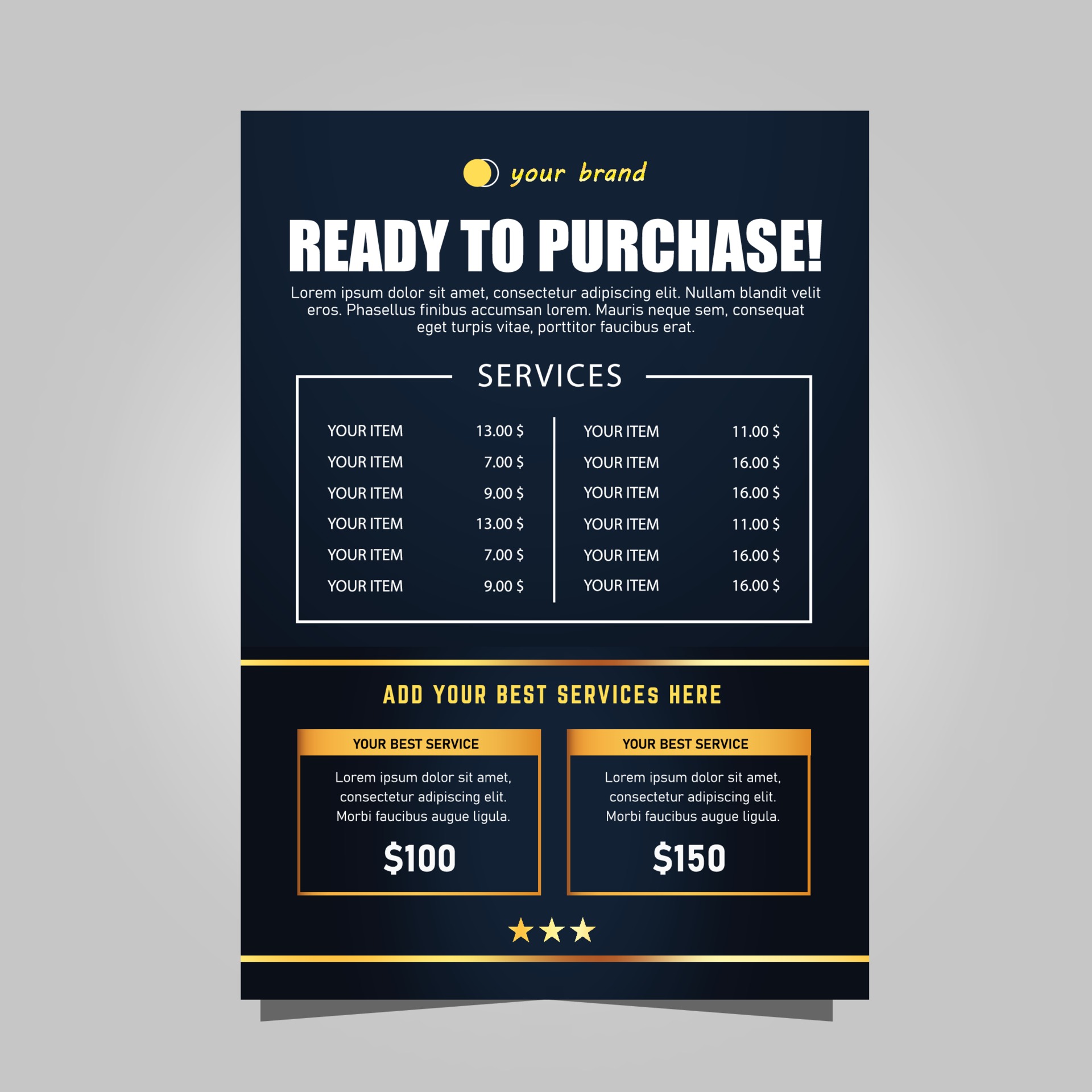
We often see these card lists in eCommerce store product lists that feature an image, title, short description, category tags, price, and “Add to cart” button. We’re also developing a new spatial app framework that helps mobile developers create mixed reality experiences. Developers will be able to use the tools they’re already familiar with to bring their mobile apps to Meta Horizon OS or to create entirely new mixed reality apps. We chose this design because it’s a great example of how you can make image lists work on a mobile UI.
You must also ensure that all elements, such as icons, text, and buttons, align consistently. While animations can be powerful, you must use them cautiously. Overdoing it can lead to a cluttered and confusing user experience.
CSS Only File Tree Structure with Folder, File Icons and Size Info
User interface design patterns are the means by which structure and order can gel together to make powerful user experiences. Products should consist of such good interactions that users don’t even notice how they got from point A to point B. To create a user-friendly list UI design, you should also consider interactions, animations, and transitions. Selection interactions for list items help users know which items they've selected. Animated lists help in attracting users' attention and provide them an interesting experience.
Three Art and Design Books for Your Spring 2024 Reading List - Boston magazine
Three Art and Design Books for Your Spring 2024 Reading List.
Posted: Thu, 29 Feb 2024 08:00:00 GMT [source]
Justinmind’s data masters feature lets you easily display data in list format. When it comes to mobile list UI design, things can get a little trickier. Due to there being less screen real estate to manipulate, it’s only too easy to create a cramped feel and lose that minimalist touch. Once you’ve ranked the order in which information should be displayed, you can use font as a way to guide your users’ attention to important elements. Deciding on which element of the list item gets this visual priority will help you draw your users’ eyes to the most important parts of the list first. Three-line list designs allow for both a primary text and secondary text paragraph of two lines.
Whether you’re interested in botanical or retro-inspired patterns, or even realistic paper textures — PicMonkey has it. You can read about how I first started using checklists in my work in this article.If you're finding Checklist useful, you can buy me a coffee. If you have any feedback or ideas to share, reach out on Twitter or send me an email 🙂. They also provided an option to expand or collapse certain items in the list with a “view more” button.
Differentiates real visitors from automated bots, ensuring accurate usage data and improving your website experience. Saves your settings and preferences, like your location, for a more personalized experience. Governs the storage of data necessary for maintaining website security, user authentication, and fraud prevention mechanisms.
The list in question here is are a group of ecourses that the user can select. Now let’s say you want to allow your users to filter through your list of contacts by order of country phone number. In this case, all you’d have to do is add a column header in order to apply the filter. When it comes to list UI design for website, designers usually have more options to play around with. This is due to the higher screen resolution, providing more screen real estate.
We hope this guide has given you some food for thought for your next list UI design. This category listing page shows a nice grid arrangement of cards with icons as an alternative to the vertical list. On each line, only the bare necessities are conveyed, such as the course name, the type of course, how many places are available and the price. This example demonstrates that, by keeping things simple, you can display many more items on screen than if you decided to go into more detail. Finally, for a great example of a single line web list UI design, we’ve chosen this ecommerce product dashboard.
The value attribute will set a list item to use the marker relevant for that position. Before you do anything too fancy, know that there is quite few settings for list-style-type that might cover your needs out of the gate. Image lists look more attractive than text lists, and that’s why they’re a popular choice among UI designers. You can often see this list type in music players, where they’re used to showcase artist photos or album covers. Others - Other details such as checkboxes, radio buttons, icons, images, and so on should be discussed and iterated to get the best UX.
Customizable lists often allow users to reorder list items by dragging and dropping them. You can indicate this by a draggable icon that users can click and hold, which will “pick up” the list item. But lists like this one keep things nice and simple for the user with a two-line list that naturally draws attention to the most important elements on the screen. Interaction is a great way to render your list UI design as intuitive as possible.
It can quickly lead to a jarring, cluttered effect where every item in the list on top of the other, giving a chaotic and claustrophobic feel. Set the itemLayout property to vertical to create a vertical list. They are useful in things like blog posts for listing out steps, recipes for listing ingredients, or items in a navigation menu. Not only are they an opportunity for styling, but they have accessibility implications. For example, the number of items in a list is announced in a screen reader to give some context to the list. Remember, you must continuously adapt to evolving UI UX design trends and explore new concepts and ideas.
This course will equip you with the knowledge necessary to select the most appropriate display methods and solve common design problems affecting existing user interfaces. This should help put you ahead of the pack and furnish you with the knowledge necessary to advance beyond your competitors. On start-up of the Photoshop application, a scrolling list design pattern is used to show users recently opened files. This helps them to select a document they are likely to want to continue working on. Without using a scrolling list, either too few options could be given or the essential learning tips at the bottom of the page would disappear from view, making them less likely to be accessed. A list inlay allows the user to view the contents of all items in a list, from one screen, by simply clicking on the item.